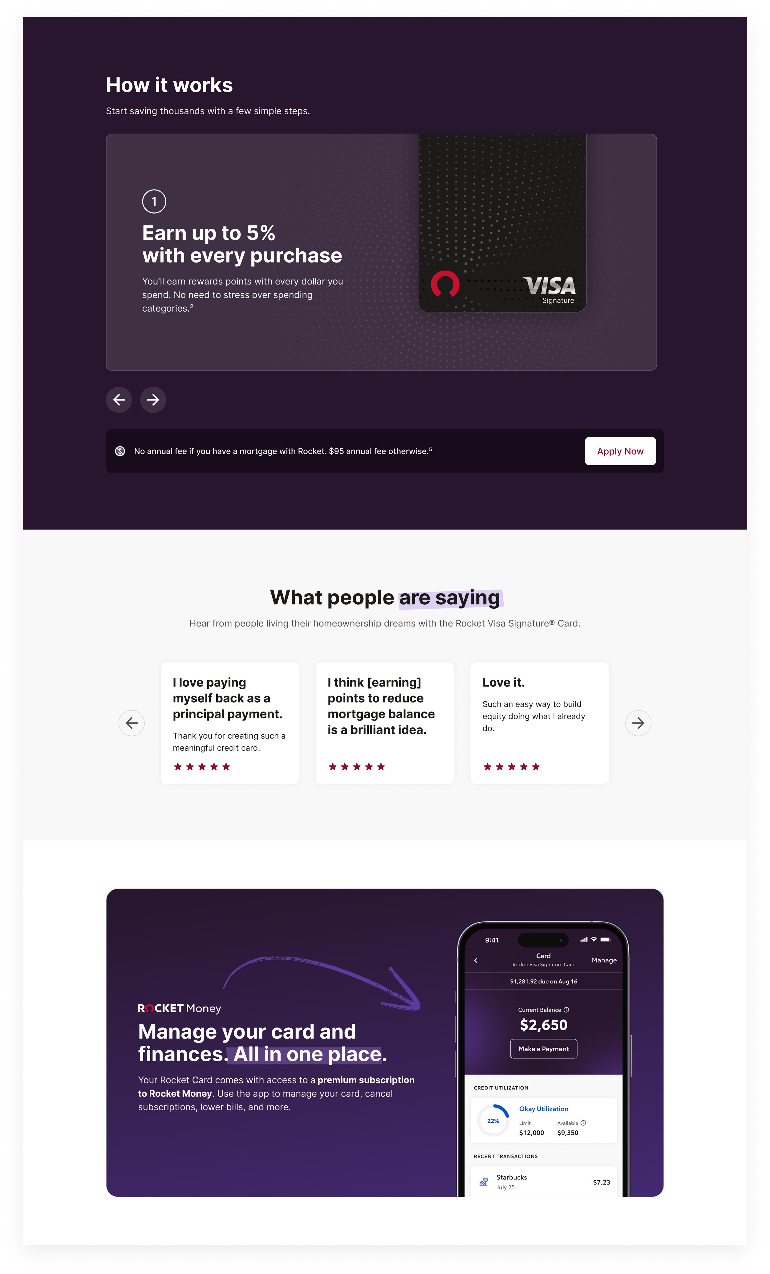
Landing Pages
The goal of redesigning Rocket Money’s landing pages was to bring a new look to the web experience that reflected the brand’s updated visual identity. The design balances simplicity and impact, with clear visuals, thoughtful layout, and tasteful infusion of the newly created “Sunset” gradient that became a defining brand element.


App Store
The rebranded App Store screenshots for Rocket Money served as the first public unveiling of the new visual identity. These designs played a key role in introducing the rebrand to users, and within a week of their release, Rocket Money became the #1 finance app in the App Store. The success of the launch underscored the impact of the refreshed design.
Emails
Building a library of scalable, customizable email components provided a streamlined process for creating emails without starting from scratch. This system greatly reduced production time by enabling the reuse of components, ensuring brand consistency while offering flexibility to accommodate different content types and design needs.
Mobile Experience
This UX/UI flow was designed to highlight the features and benefits of the Rocket Visa Signature® Card. The goal was to create an engaging, visually cohesive experience that clearly communicates the card’s unique value propositions, using Rocket Money’s signature dark-mode aesthetic. The key to proper implementation was to guide users intuitively through the benefits and simplifying financial concepts through engaging visuals, while maintaining Rocket Money's brand identity.
![[Mockup] iPhone 14.png](https://images.squarespace-cdn.com/content/v1/670ec2da2453fd5075bfa573/01934b2c-8376-43f9-bae9-e6e3a4210317/%5BMockup%5D+iPhone+14.png)
![[Mockup] iPhone 15.jpg](https://images.squarespace-cdn.com/content/v1/670ec2da2453fd5075bfa573/568aa7e8-3ebe-41f4-bb56-2b7ca950ca14/%5BMockup%5D+iPhone+15.jpg)
![[Mockup] iPhone 16.jpg](https://images.squarespace-cdn.com/content/v1/670ec2da2453fd5075bfa573/5ddf9979-ed3d-41dd-974f-aea26056e018/%5BMockup%5D+iPhone+16.jpg)
![[Mockup] iPhone 17.jpg](https://images.squarespace-cdn.com/content/v1/670ec2da2453fd5075bfa573/9645762c-f200-4c67-b707-3c866055b87c/%5BMockup%5D+iPhone+17.jpg)
![[Mockup] iPhone 18.jpg](https://images.squarespace-cdn.com/content/v1/670ec2da2453fd5075bfa573/525ebee9-d8dc-48e3-b28a-a6682322e3a9/%5BMockup%5D+iPhone+18.jpg)
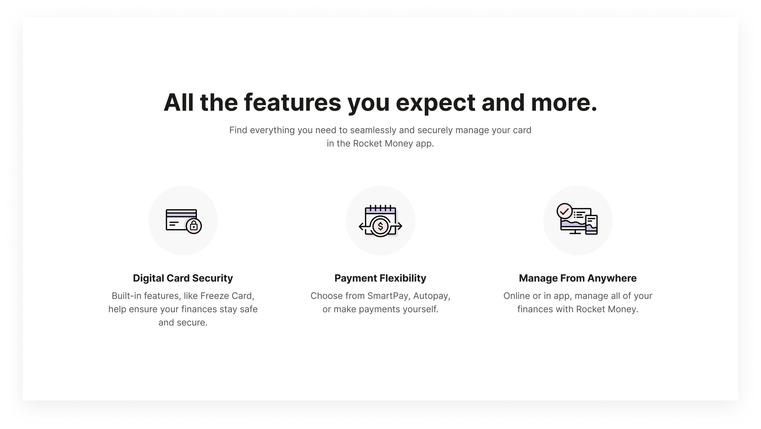
Pictograms
This pictogram library, consisting of 150+ custom-designed pictograms, quickly became one of Rocket Money's most brand-defining visual assets. These simple yet distinctive icon-like illustrations have been used across the company to visually communicate complex ideas in a clear and engaging way.


